All documentation · Plugin overview
Choose among ten compositions
Understand what changes beyond color when selecting a design.
Version 0.4.0-alpha.1 · Development alpha · Updated 20 September 2026
Classic designs
| Design | Composition |
|---|---|
| Split | Details left, summary right. |
| Boutique | Centered, framed single column. |
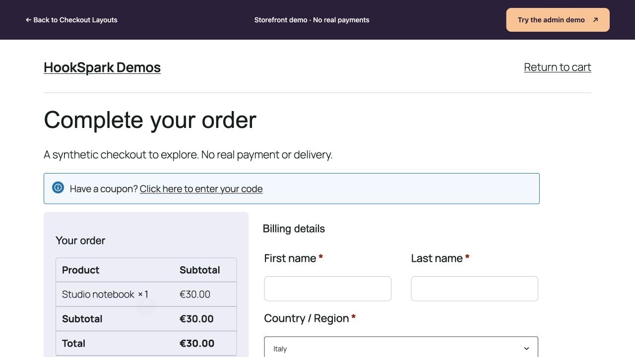
| Studio | Compact card with summary first. |
| Outline | Three desktop columns for details, delivery and order. |
| Soft Cards | Accordion sections with editable summaries. |
| Editorial | Larger header and asymmetric columns. |
| Digital | Order summary left, details right. |
| Contrast | Dark order panel. |
| Guided | Details, delivery/notes and payment steps. |
| Review | Separate review before the payment step. |
Keep or replace the style
The gallery and Design selector apply the new composition and its default palette and typography. Check Keep my colors and typography when changing design to retain your styling. Content, images and page width remain. Use design colors restores the selected design’s palette. Undo and Redo operate within the current editor session.
Blocks is a separate engine
Focus and Compact use the existing native Checkout Block. They are not two additional classic templates. Classic-only appearance controls are disabled. Changing engines does not migrate Blocks-only fields or gateways, and the original page content is never rewritten.
Verify
Compare Split and Digital on desktop: the summary changes side. Compare Boutique: the page stacks vertically. Mobile may stack all three; that alone does not mean desktop compositions are identical.